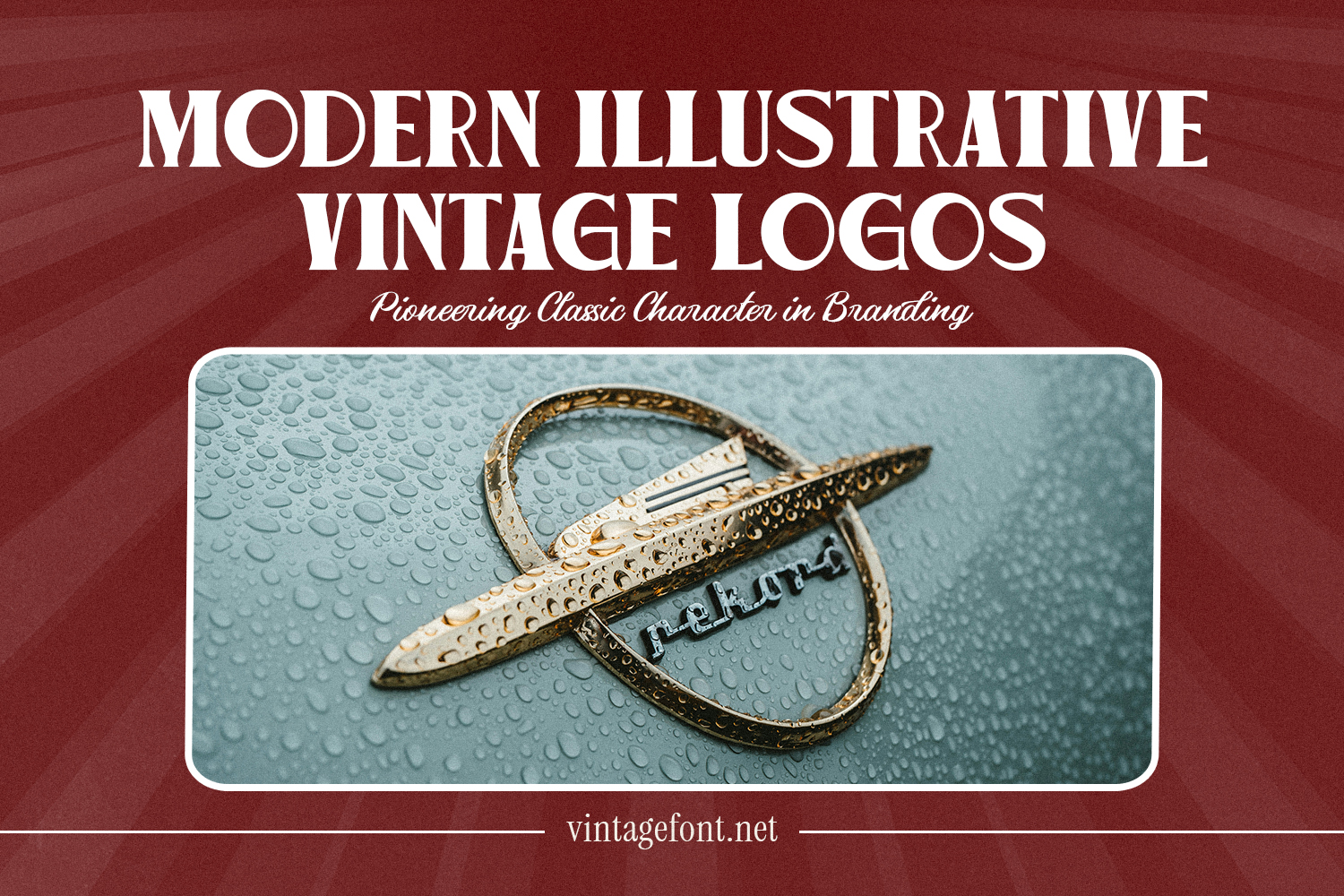
Illustrations have been an important part in designing vintage logos. Many classic brands use illustrations to provide a strong visual character as well as help tell the brand identity right away.
However, as modern branding needs have increased, an illustrated approach that was once excessively detailed has been simplified. This shift is why modern illustrative vintage logos exist. This design retains the power of illustration as an identifying element but in a cleaner and more controlled format.
That said, modern illustrative vintage logos adapt seamlessly to today’s visual demands. This article explores how vintage illustration has evolved in the modern era, highlights its key characteristics, and explains what sets it apart from classic vintage styles.
Table Of Content
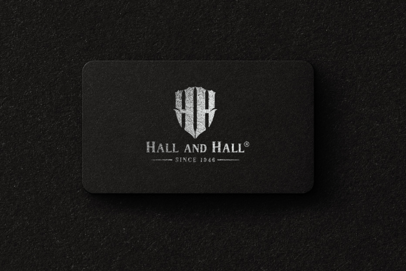
Modern illustrative vintage logos are a logo style that uses illustrations as their main visual identity but in a much simpler version. Unlike classic vintage illustrations that are very detailed, the modern version emphasizes a clearer shape, neater composition, and better readability.
The illustration in this style no longer functions as a complex and decorative image but as a visual symbol to strengthen the brand character. Each line is cleaner, with fewer details and well-arranged proportions, making the illustration clear and readable in different sizes and media.
This style makes it possible for the illustrations to exude vintage nuance without looking overdone or too historical. With the simplification, modern illustrative vintage logos can be flexibly applied in various branding media, starting from packaging to digital platforms.
The following visual characteristics differentiate modern illustrative vintage logos from classic vintage ones. The main distinction is how the illustration is streamlined and blended into a much more modern logo structure.
Illustration is no longer full of textures and small elements. Unnecessary details will be reduced to ensure the main shape remains clear.
Line weight in modern illustrative vintage logos tends to appear more stable compared to the classic vintage illustration with its very contrasting, varied lines.
Engraving and grain effect or complex shading is usually simplified to ensure the logo is easy to use in various media.
The illustration is placed in a more structured manner, making the logo appear neither full nor heavy.
The illustration is carefully designed to make sure it is readable when applied in small-sized media like packaging, digital icons, or other applications.
Typography in modern illustrative vintage logos plays a supporting role, enhancing the illustration without overpowering it. Since the illustration itself is already visually dominant, simpler typography is typically chosen to create balance and maintain a cohesive logo composition.
The most common type of fonts used in these logos are either serifs or sans-serifs with a simple look and classic nuance. Those types of fonts help maintain readability and balance well with the character of vintage illustrations. In many cases, texts are placed as supporting elements that strengthen the brand identity without stealing the attention from the illustration.
In modern illustrative vintage logos, typography and illustration work as a visual unity that supports each other. Discover various types of typography with a classic feel at vintagefont.net, and make your designs more appealing.
Modern illustrative vintage logos generally use a simpler color palette than their classic counterparts. While classic designs often incorporate rich colors, textures, and complex shading effects, the modern approach reduces these elements to maintain a clean logo look and ensure easier application across different media.
The color palette typically consists of one to three primary colors. Cream, dark brown, dark green, and other muted tones work well to preserve the vintage feel. This approach allows the illustration to remain the focal point without making the design feel overcrowded.
Furthermore, many modern illustrative vintage logos are designed to maintain the effectiveness of the logo in one-color version. This is crucial to ensure that the logo can be flexibly applied in various media, starting from packaging to digital applications.
Modern illustrative vintage logos work best for brands that want to build a distinctive visual identity through illustration while keeping the overall look clean, contemporary, and adaptable across various media. The following are some brands that commonly use this style:
F&B brands, such as restaurants, coffee shops, and food goods, often utilize this logo to present a distinct visual identity with illustrations, such as product-related mascots.
This type of logo is suitable for brands seeking to show product quality, process, and uniqueness. Those brands include coffee roasteries, small breweries, or premium handmade products.
Illustrations are often used to depict natural elements, outdoor activities, or exploration and adventure-related symbols.
Brands that want to build a strong character through distinct symbols and illustrations can use this style to strengthen their visual identity.
On the other hand, modern illustrative vintage logos are not really ideal for brands that want a minimalist or typographic visual identity. This is because illustrations often serve as the dominant elements in logo compositions.
Modern illustrative vintage logos show how classic illustrations can adapt to contemporary design needs. With simplified illustration details and neat compositions, the vintage character remains intact without losing its relevance in modern branding.
This stylistic approach allows brands to leverage the power of visual storytelling while maintaining flexibility across various media. When illustrations are designed with the right structure, modern illustrative vintage logos can become a strong, distinctive, and easily recognizable visual identity in an increasingly competitive branding landscape.
