Behind every vintage logo, there are time traces that bring us back to various designs in specific eras. Those design compilations from various eras are then called vintage logo styles. This is not a single style, but a compilation of aesthetics from various periods. Starting from the majestic Victorian, 1920s geometric touch, warm nuance of Mid-century, and the distinct rough texture of Rustic Americana. Each era provides its own visual nuance and together creates the main category in the world of vintage logos.
Even though it is rooted in the past, vintage logo styles remain as the choice of many modern brands. The reason is clear, this style provides a touching nostalgia, a human warmth, authentic craftsmanship value, and a timeless aesthetic that is still relevant. Vintage logos not only work as visual identity but also as an emotional experience that is able to connect brand with audience more personally.
This article will talk about six fundamental styles that become the foundation of vintage logo styles. It helps you understand how each style can be effectively implemented in today’s branding strategy.
Table Of Content
These six fundamental styles summarize various visuals from different eras in vintage logo styles. Each style has its own characteristic that helps designers determine the aesthetic direction, from typography to illustration. By understanding the differences between styles, the logo design process becomes more focused while still maintaining a vintage identity. These styles are listed as the basis to know a more specific visual approach.
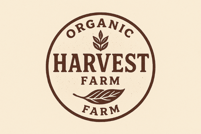
Vintage Badge Logos is one of the most iconic vintage logo styles. This style makes use of basic shapes’ strength and symmetrical aspect, such as circles, shields, and diamond, creating a look that is firm and easy to recognize. This style visually stands out through its structured hierarchy composition, the use of uppercase bold serif, curved text, and divider elements like stars or lines strengthen the whole design.
This is one of the vintage logo styles that coffee shops, barbershops, home beverages brands, outdoor gear brands, and even retro-themed fashion brands often use to create a warm, classic, and memorable feel. Besides, Vintage Badge Logos is flexible for various media, such as packaging, labels, and stamps, making it the effective choice for branding needs.
Rustic and Handcrafted Logos is one of the logo styles that presents a natural feel and hand-made touch. The distinct characteristic of this style lies in its rough textures, imperfect lines, and organic-themed illustrations, such as leaves, woods, or other natural elements. It uses a natural color palette, such as brown, cream, or earthy green, strengthening the visual character that is warm and authentic.
This is one of the vintage logo styles that coffee shops, home bakeries, and even brands that carry organic or eco-friendly concepts often use for their logo. The look is simple yet full of character, making it effective for the brand to build a friendly and trustworthy story for audiences. With a natural and humane visual identity, this rustic and handcrafted style helps the brand emphasize the value of authenticity and detail-oriented work processes.
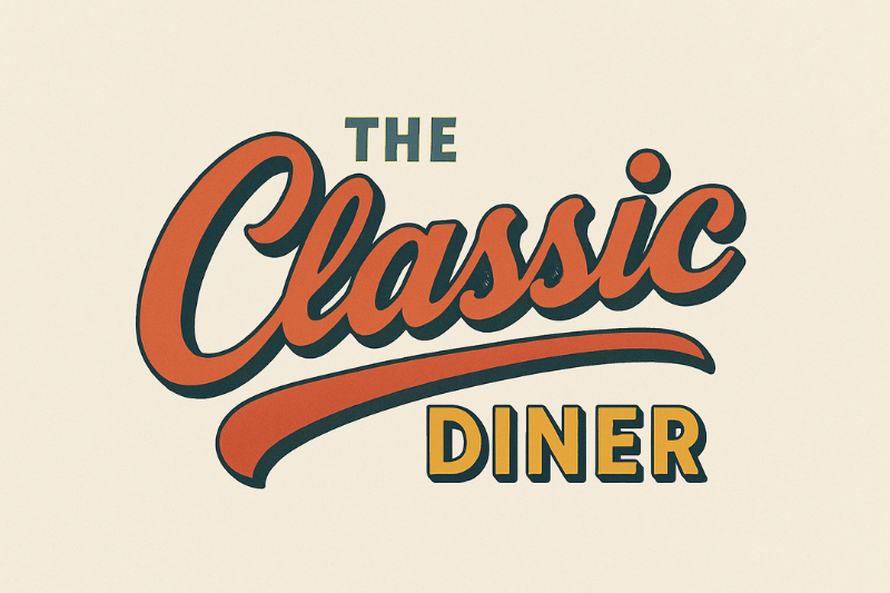
Retro Script Logos is one of the vintage logo styles that has a flowing and curved script letter, inspired by the signage era in 1950 – 1970s. The visual characteristic includes bold letters with soft curves, thin shadows to give a depth impression, and a warm retro color palette such as terracotta, mustard, soft brown, or dusty blue green. All the elements create a friendly, casual, and playful impression.
Ice cream shops, retro dinners, classic bakery shops, aesthetic café, and brands with vintage lifestyle concepts usually use this style. It is important to note that in the design process, the use of shadows needs to be restrained to maintain a retro look and not become cartoonish or excessive.
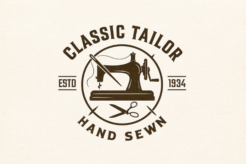
Heritage/Classic Emblem Logos is in this list of vintage logo styles for its classic aesthetic with a structure resembling an emblem, seal, or traditional badge. This style combines wise serifs, symmetrical geometric shapes, and a neat decorative element. Those compositions create a formal, stable, and historic visual image, making the logo look like a long-standing brand.
Tailor industries, premium barbershops, hotels or brands that emphasize traditional or inheritance value usually implement this style. Keep in mind that the use of ornamental elements needs to be controlled because an overuse detail will make the design look old or too heavy.
Minimal Vintage/Clean Retro is in the modern category of vintage logo styles that presents a simple detail with minimalistic and clean layout. This approach prioritizes neat and clean visual shapes, making the retro vibes remain, but lighter. The visual characteristics include smooth serifs, simple geometric shapes, and retro pastel color palette, such as sage, muted blue, and dusty pink. The element combination creates peaceful and soft nuance with the mix of modern and nostalgic impression.
Minimal/Clean Retro mostly presents in skincare brands, modern coffee brands, and creative studios that want to look elegant without leaving a vintage touch. Its supremacy lies in the retro character that is more subtle and fresh, making it flexible to be implemented in various branding occasions without looking heavy or too decorative.
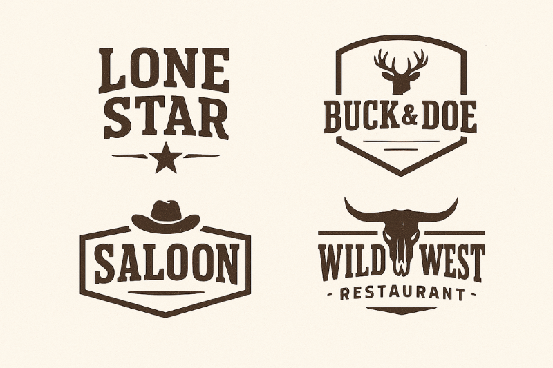
Western or Cowboy Vintage Logos provides the Wild West era nuance that is identical to the strong, firm, and masculine impression. This style is widely used in F&B industries and apparel that want to show a sturdy visual identity and classic character. Its visual elements include bold slab serifs, firm geometric shapes, such as rectangle or triangle, and earthy brown or charcoal color palette. The combination results in a rugged and tough look, strengthening the distinct atmosphere of western classics.
This category of vintage logo styles is commonly implemented in BBQ restaurants, denim brands, boots shops, and motorcycle workshops. As for maintaining relevancy, the implementation needs to be adjusted with the brand personality, so that it does not seem forced. The element arrangement, color selection, and typography style should support the overall brand character, resulting in a consistent and authentic visual identity.
Determining the right vintage logo styles starts from understanding the feel that the brand desires to highlight, whether it is warm, premium, playful, rugged, or modern retro. The nuance will be the foundation in selecting the visual elements so that the brand identity is shaped consistently. After that, adjust the logo style with the industry and target market, because each sector has different visual needs. Rustic style is more suitable for handmade products, while retro script style is good for culinary businesses with casual impressions.
Avoid combining the style that is not in line, for example mixing retro script with Western slab, because it can be confusing and weaken the visual identity. Consistency remains the main principle in building vintage visual identity. When style, color, and typography are implemented in line, brands will look stronger, recognizable, and remain relevant in various media.
The selection of vintage logo style is the foundation that determines the strength of a brand visual identity. Style that is in line with the character and brand’s objective will result in a consistent look, recognizable, and relevant for various communication needs.
Adding the understanding of various vintage styles becomes the foundation in arranging the brand visual direction to be more directed, authentic, and characterized. To widen your horizons and find other relevant inspirations, you can continue exploring our website pages here vintagefont.com.
