The 1950s and 1970s were important periods in the development of graphic design, particularly in the exploration of character-driven typography. During this time, pop culture, the entertainment industry, automotive culture, and the growth of advertising encouraged the emergence of bold, dynamic, and expressive font styles. Among these, retro script logos became a strong visual representation, featuring flowy, bold, and connected letterforms that create an energetic and eye-catching impression.
Until now, retro script logos continue to be relevant in the branding world because this style presents an authentic nostalgic nuance without reducing its commercial appeal. The visual character is effective in building an emotional closeness to the audience as well as strengthening the consistent and personalized brand identity.
In the vintage design structure, using retro script logos makes them strategic as the visual foundation. This typography becomes the main element in building a certain atmosphere as well as maintaining the consistency of a directed and powerful classic identity.
Table Of Content
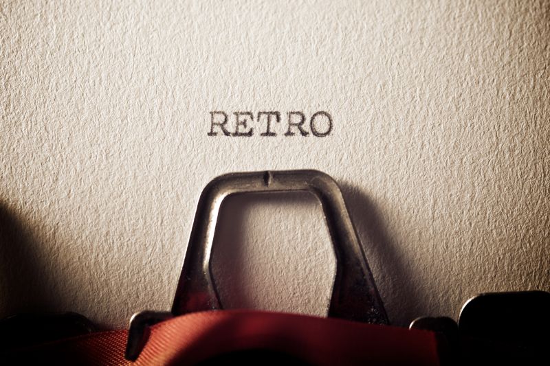
Retro script logos are cursive-based logos created to convey a classic visual nuance using a structured and distinctive typographic style. This style refers to a commercial design practice from the mid-twentieth century. This method focuses on letters as the major element in developing the brand identity, as well as stressing readability and high visual appeal in various promotional materials.
Visually, a retro script style emphasizes the solid nature of the shape, harmonious letters, and stable composition, resulting in a solid appearance that can be applied across multiple mediums. Retro script logos highlight bold, personal, and commercial visual appeal, as opposed to modern scripts or luxury calligraphy, which emphasize smooth details and exclusive impressions.
To understand the overall visual power, designers need to identify the key characteristics that build the foundation of the retro script character. The following are three of the most dominant and often applied visual elements used by many.
The letters of retro script logos are constantly connected to form a harmonious visual unity. Designers organize each character with a directed line flow to achieve a consistent visual rhythm. Each line swash has a distinct action, producing a dynamic yet controlled stroke. Furthermore, the structure preserves readability while also emphasizing the retro-style identity’s particular nature.
Retro script logos offer different measured line weights. That difference creates a natural visual emphasis that resembles a brushstroke. The designers arrange this contrast to give a dimension and depth to the letterform without reducing its readability. With proper management, a logo will appear strong and not overdone.
Retro script logos often utilize letter tails or additional swashes as supporting decorative elements. These elements balance composition and strengthen the visual identity. Designers control the swash’s use to ensure it does not disturb the main letter structure. With proportional implementation, the visual expression will look captivating and professional at the same time.
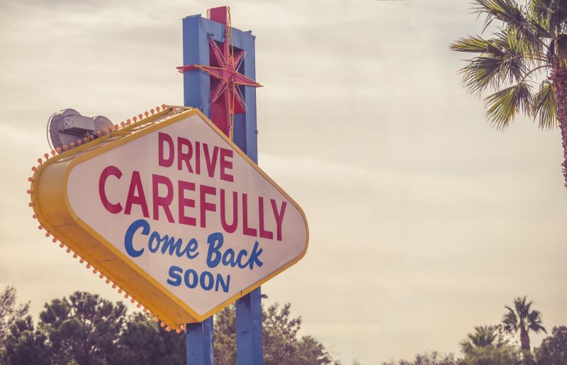
The impact of the 1950s-70s era can be clearly seen in the shapes and characters of Retro Script logos. In those times, there were many restaurants using signage with bold, cursive letters that were easily readable from a distance. These signs emphasize readability as well as visual appeal; hence, they were created to look striking and characterful.
Besides that, branding for products like sodas, automotive, and surf cultures also uses dynamic and energetic script styles for their logos. Logos function not only as a brand representative but also as an active and optimistic lifestyle. Posters and product packaging in the mid-century era also used this typography as their dominant element in the design composition.
All these effects contribute to an optimistic atmosphere and a strong expression, which have become the main characteristics of contemporaryRetro Script logos.
The selection of a script style is the first step in deciding the characters of Retro Script logos. Generally, this style is divided into two main categories: brush script and smooth script. Brush script presents a brushstroke impression that gives energy and strong visual expression. On the other hand, a smooth script offers smoother and neater lines that maintain both readability and weight.
In its application, Retro Script font is generally used in large-sized media as the headline or the logo’s main element. Designers create the letter with proportional thickness to maintain readability and keep the audience’s attention on the brand name. In this style, the script does not function as the supporting element but as the dominant center of the visual identity.
Designers need to avoid the use of letters that are too thin, modern, or like formal calligraphy. Shapes that are too thin or overly elegant can diminish the sense of strength and weaken the vintage character, which is a distinctive feature of Retro Script logos. To find the most suitable reference, designers can look for various retro fonts through vintagefont.net as it offers various classic and vintage font collections.
Color plays an important part in strengthening the character and atmosphere of Retro Script logos. Choosing the right color can support readability and evoke a consistent vintage nuance in a design. The following are some color characters commonly used in Retro Script logos.
This style commonly uses bright colors popular in the mid-century era. Most of the time, designers choose classic red, dark blue, mustard, olive green, cream, or warm color combinations. These colors help build a nostalgic feel without looking dull. As a result, choosing one of these colors will strengthen the vintage character consistently.
Retro Script relies on clear color contrast to make the letter readable. Designers often use the combination of red and cream, dark blue and white, or yellow and black to enhance visibility. High contrast is important, especially if the logo is applied to signage, packaging, or outdoor media.
The use of thin outlines or light drop shadows is often applied to give an additional dimension to the letters. This element helps separate text from the background without making the design appear heavy. Therefore, designers need to proportionally arrange the effect weight to ensure it stays harmonious with the clean and solid retro character.
Retro Script logos can be successful in both one-color and full color. The one-color version is ideal for versatile applications such as screen printing or embossing, while the full version creates a dramatic setup with classic visual appeal. Designers must ensure that the logo remains readable and compelling when used in its monochromatic version.
Understanding the difference between Retro Script and other foundation styles helps designers determine the right visual direction. Each style has different typography structures, nuances, and usage contexts.
Retro Script looks neater, thicker, and more structured, resulting in a dynamic and commercially ideal appearance. The letters are connected to each other with a clear composition, perfect for logos with a strong and readable look. Meanwhile, the Rustic and Handcrafted style tends to demonstrate rough textures and asymmetrical shapes, making them look more natural and conventional.
Retro Script has many curves and swashes in its letterforms. This style often utilizes outlines or other additional effects to strengthen the characters. On the other hand, Minimal Clean Retro looks simpler and cleaner with fewer details. Using Retro Script will let a design feel more expressive, while minimal clean retro will make it appear calm and modern.
Retro Script uses cursive style as the logo’s primary element. Conversely, Modern Vintage Monogram logos typically employ symmetrically arranged letter initials, creating a formal appearance. Monogram gives an exclusive and elegant impression, while Retro Script feels more energetic and communicative.
Retro Script logos are the most effective for business owners that want to convey a warm, expressive, and nostalgic image. The choice of this style should be tailored to the personality of the brand, ensuring that the visual identity is consistent and does not contradict the brand’s concept.
Retro Script logos are incredibly suitable for the food and beverage industry, as they evoke a classic and friendly atmosphere. The bold, flowy, and slanted letterforms help create an impression of speed and friendliness, making them appealing, especially when put on signage or packaging.
In casual fashion or streetwear, Retro Script gives a funky and fearless impression that looks relaxed at the same time. This style is perfect to demonstrate a strong, expressive identity, as it is easily recognizable, especially in T-shirts, jackets, or caps.
Retro Script logos work perfectly on brands with nostalgic or throwback themes. The letter characters are able to build an atmosphere from a certain era, allowing the audience to directly feel the classic and authentic nuance.
Keep in mind, this style is less suitable when used for brands with a luxury, formal, or minimalist technology concept. Its expressive and decorative character can clash with the elegant, exclusive, or futuristic image that requires a cleaner and simpler appearance.
Retro Script logos, among other vintage typography styles, are ideal for serving as an expressive and recognized visual foundation. This style features bold, connected letterforms along with color palettes that set a nostalgic tone. By understanding the distinctiveness of this style from other styles, designers will be able to properly and strategically apply retro script in their design to evoke nostalgia and connect with audiences on an emotional level.
However, before choosing to use Retro Script logos, make sure that the style is aligned with the concept and the target audience. The retro script character is best used to strengthen the brand identity, not just as a decorative element. Hence, apply this style in a well-thought-out and consistent manner to create a strong, relevant, and memorable brand’s visual identity.
