In today’s fiercely competitive branding landscape, a logo transcends being merely a symbol for renowned brands. A logo serves as a powerful visual representation of a brand, creating a lasting impression that resonates with the audience. Imagine strolling through a mall and spotting someone carrying a shopping bag emblazoned with H&M. You can immediately recognize where they have been shopping, can’t you? The absence of an image and the full brand name doesn’t hinder the brand’s identity; it is already well-established in the audience’s consciousness.
In today’s world filled with visual noise, crafting a brand identity through simple yet powerful lettermark logos is truly a work of art. A logo becomes unforgettable when crafted with a thoughtful design strategy that aligns seamlessly with the brand’s purpose and features a simple shape. While lettermark logos lack visuals or icons, they create undeniably strong and memorable impressions.
Table Of Content
A lettermark logo focuses on just a few letters, transforming them into the central visual element of its design. A lettermark logo is a typography-based design that showcases the brand’s initials in a stylish and memorable way. At times, simplifying a brand’s visuals with simple and clear typography can enhance memorability for the audience you’ve crafted your design for. The H&M brand, an abbreviation of Hennes & Mauritz, effectively showcases its unique identity. Additionally, a variety of well-known and easily identifiable examples of lettermark logos can be found below:
What makes them different? The answer is because they are simple and concise. Basically, lettermark logos change the font and arrangement of letters in creative ways to show what the brand is all about. Even though this logo looks simple, it takes careful planning to get the brand’s essence across through its typography alone. This type of logo is ideal for brand names that are long or challenging to spell.
Choosing this type of logo is the perfect way to establish your brand’s visual identity, making it suitable for nearly every business type. But the real question is, “When is the ideal moment to utilize lettermark logos?”
Well, when your company or brand has a lengthy name or complex spelling, that’s the ideal moment to embrace the power of lettermark logos. For a brand aiming to convey conciseness, elegance, and memorability, opting for a lettermark is a beneficial option for the company. Here are the key benefits of using a lettermark logo that you should be aware of:
One of the main advantages of lettermark logos is their ability to simplify the brand’s name and make it memorable. Some audiences prefer short wording over the long ones, and the use of a lettermark logo will make it easy for the audience to remember since it only uses initials.
Lettermark logos give a formal and professional impression, especially when combined with the right typography. Many companies choose this type of logo because it is considered broad and reflects the confidence of the company in front of the audience.
You can use the design of a lettermark logo in various contexts without the need for additional visual elements like icons or illustrations. Such versatility makes this type of logo ideal for brands that want to appear minimalist.
The concise shape of this type of logo makes it easily adaptable in various platforms including social media profile, product packaging, and billboards. Small logos with one or two words in them will be easier to remember even in small sizes.
Lettermark logos boast a distinctive design, characterized by their unique shapes, spacing, and styles. This versatility allows us to delve into endless possibilities, crafting a signature look that is truly our own.
After understanding what a lettermark logo is and its advantages, you will now explore how it can be designed with a vintage visual style. If lettermark logos usually appear in a modern and clean style, adding a vintage touch will make your logo’s visuals even more attractive and distinctive. The vintage style, which is synonymous with nostalgia and history, can impart a classic elegance, for example, by applying classic serif, gothic, and retro-style script fonts to the logo you are designing.

In a world where trends change constantly, vintage-style lettermark logos remain relevant across different eras and have even become popular again in the modern era. Its emphasis lies on classic design elements such as retro fonts, color palettes, or symbols that can evoke nostalgia.
Vintage lettermarks have an enduring appeal that captures your attention. They can meet the needs of the times by presenting a timeless classic impression, building emotional closeness, and offering visual uniqueness that stands out from most modern logos. Combining a lettermark logo with a vintage style allows the visuals to tell a story about heritage, quality, and a historical approach to its audience. Here are the main characteristics that define the visual identity of vintage-style lettermark logos:
The vintage style heavily relies on font selection, such as classic serifs, retro scripts, or fonts with an industrial and old-west feel.
Vintage characteristics include a color palette that conveys an impression of being worn, elegant, or antique, featuring colors such as dark brown, maroon, old gold, or bronze.
Vintage designs usually use texture effects such as graininess, stamps or seals, and shadows. This can add a traditional impression, as if the logo was manually created in the past.
Although lettermark logos consist of letters, vintage styles often add decorative embellishments to enhance aesthetics, such as curved frames, symmetrical lines, or floral elements.
Vintage-style lettermark logos tend to have symmetrical structures and harmonious proportions, making them look elegant and well-organized. These letters are usually placed in the center of the composition, surrounded by ornaments in other forms.
In this part, you will see several examples of vintage-style lettermark logos. With a monogram approach, classic typography, and timeless color selection, some of these logos prove that letter-based designs can be very iconic. Here are some of them:
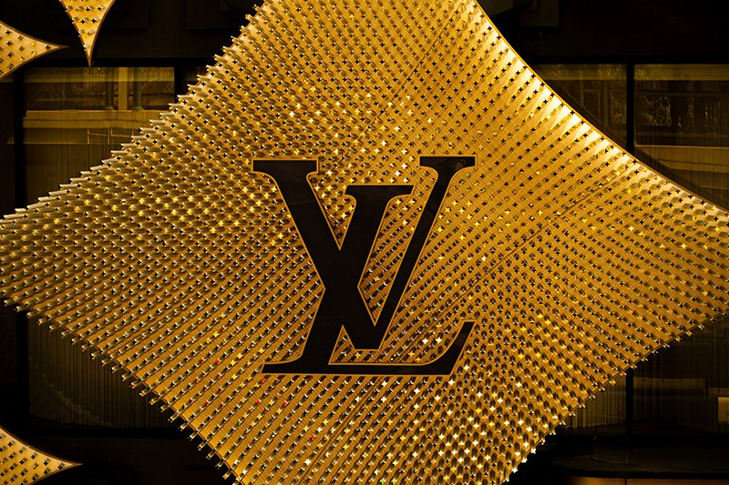
LV is an abbreviation for Louis Vuitton, a fashion house from France that has been established since 1854. This logo is a classic example of a vintage-style monogram lettermark that has endured and is globally recognized. Using classic serif typography, with overlapping letter compositions and often displayed in gold or dark brown. LV reflects the ancient luxury of exclusive and elegant European heritage.
The CHANEL logo features two C’s back to back. It has a minimalist design, with only 2 letters, but is quite iconic and characterful. Often displayed in black and white, its bold typography maintains a feminine touch, enhancing an elegant and timeless impression.

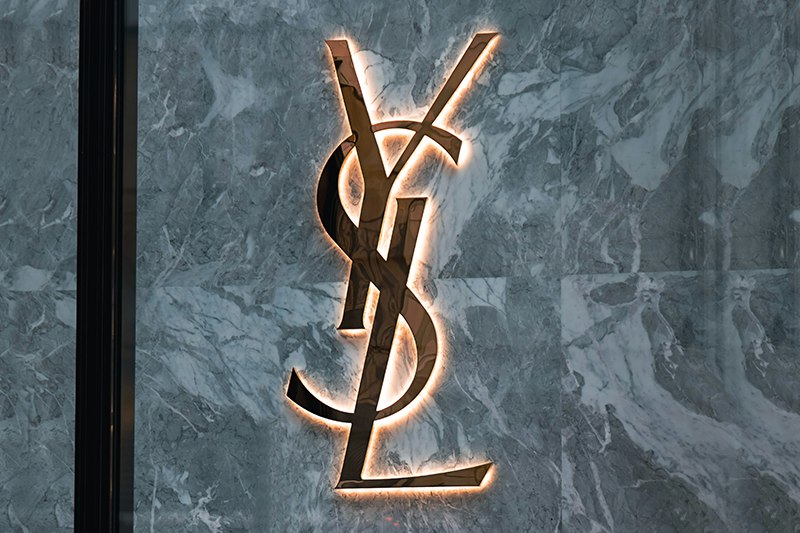
This lettermark logo is arranged vertically and overlaps with the initials Y, S, and L. It uses a slim serif typography in a classic French style, with dominant colors of black or gold to reinforce a timeless impression.
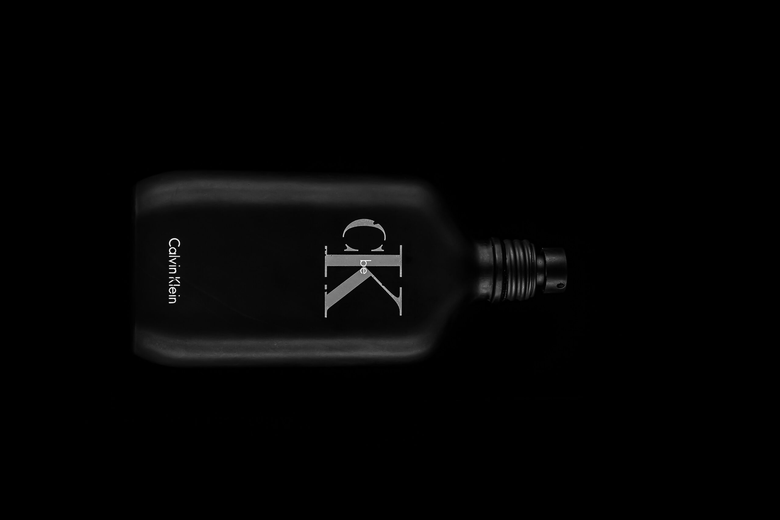
Last but not least is Calvin Klein, an American fashion brand that incorporates its successful brand name into its initials. The lettermark logo used by Calvin Klein is simple in form but strong in identity. Calvin Klein designs the letters C and K with a clean sans serif and closely spaces them to create a strong and modern impression.
In summary, designing a vintage-style lettermark logo goes beyond merely positioning a handful of initial letters in a timeless fashion. Crafting a visual symbol that encapsulates the essence, narrative, and principles of a brand using just letters is an art form in itself. The vintage style captivates with its unique charm, stirring emotions and evoking nostalgia. It highlights timeless aesthetics and delivers a visual warmth that endures through the ages.
Additionally, creating vintage-style lettermark logos relies on achieving the perfect harmony between functionality and visual appeal. Selecting the perfect typography, crafting a visually appealing layout, and maintaining readability across various platforms are crucial elements to consider. To craft vintage-style lettermark logos, a designer must deeply grasp the brand’s essence, ensuring the logo embodies a retro identity that captivates the audience and stands the test of time.
In today’s ever-evolving landscape of branding, lettermarks continue to hold their ground and thrive in the global marketplace. Combining lettermarks with a vintage style is the perfect choice, as it can elevate an initial-based logo into a powerful and enduring symbol. Unleash the power of letters; design vintage-style lettermark logos that instantly grab attention. Lettermark logos boast a distinctive design, characterized by their unique shapes, spacing, and styles. This versatility opens up endless possibilities for us to craft a signature look that is truly our own.
