Slab serif fonts emerged in the early 18th century with their daring and bold look. This type of font was first used for illustrations and wooden printed ads. Ever since that time, slab serif fonts have continued to grow in popularity. So, if you are looking for something unique to enhance your designs, this typeface may be the best one for you.
The design of slab serif aims to grab attention and leave a lasting impression. Given the growing importance of the printing industry, using strong typography is the most effective way to advertise products or services. Previously, there had never been a typographic style as strong as this for commercial purposes. Its strong characteristics make it more suitable for signboards, posters, and advertisements in the print media.
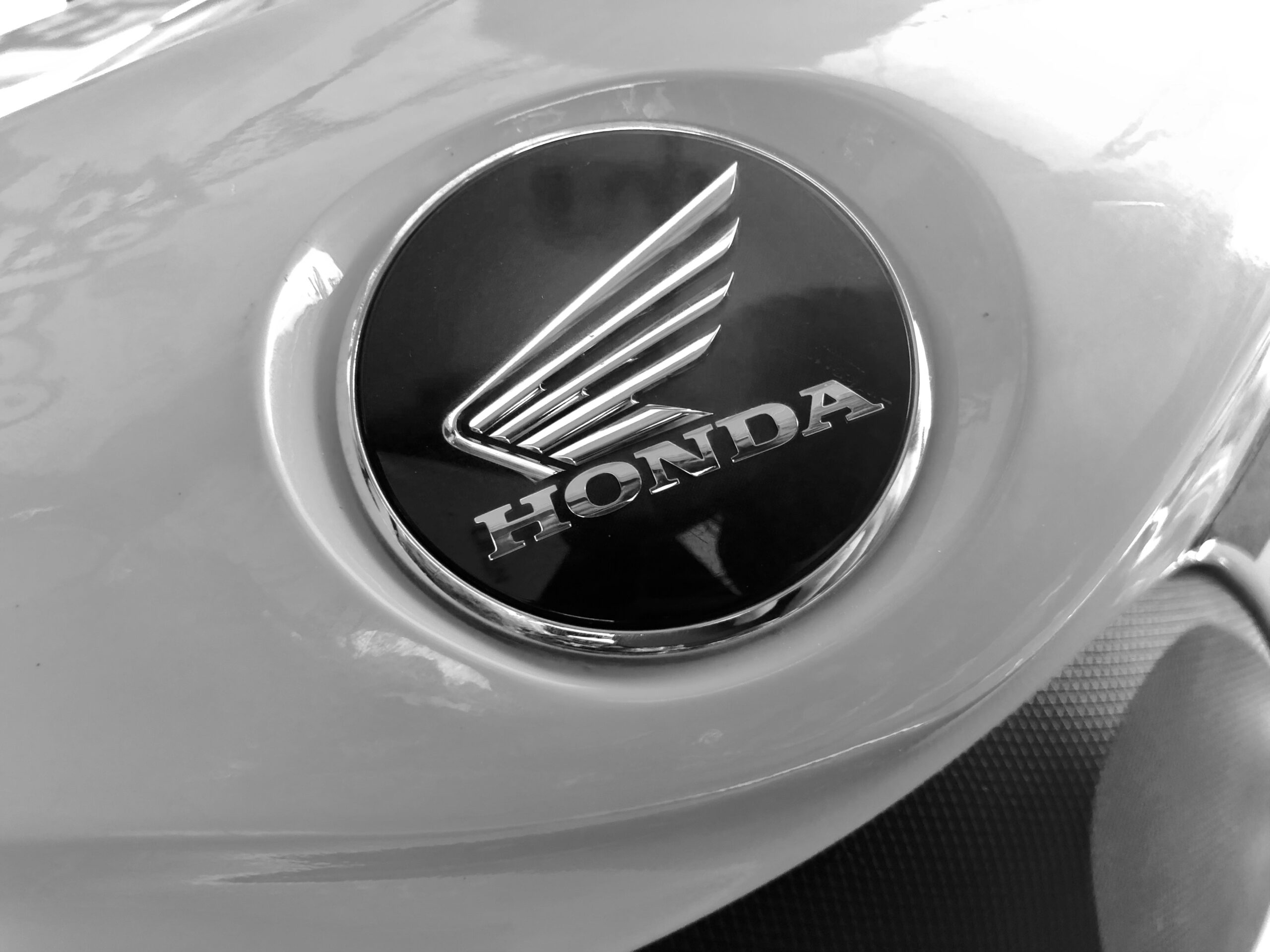
Many brands use the slab serif style for their branding; just take a look at the logos of Volvo, Sony, and Honda. These logos are characterized by their iconic corners, curves, and easily recognizable features. This design gives the brand a bolder impression than other logos.
Now that you’ve discovered the appeal of slab serif fonts, what is it that gives their appearance such a bold edge? The aesthetic relies on the unique typography of each letter, showcasing a consistent thickness and a well-defined structure.
Table Of Content
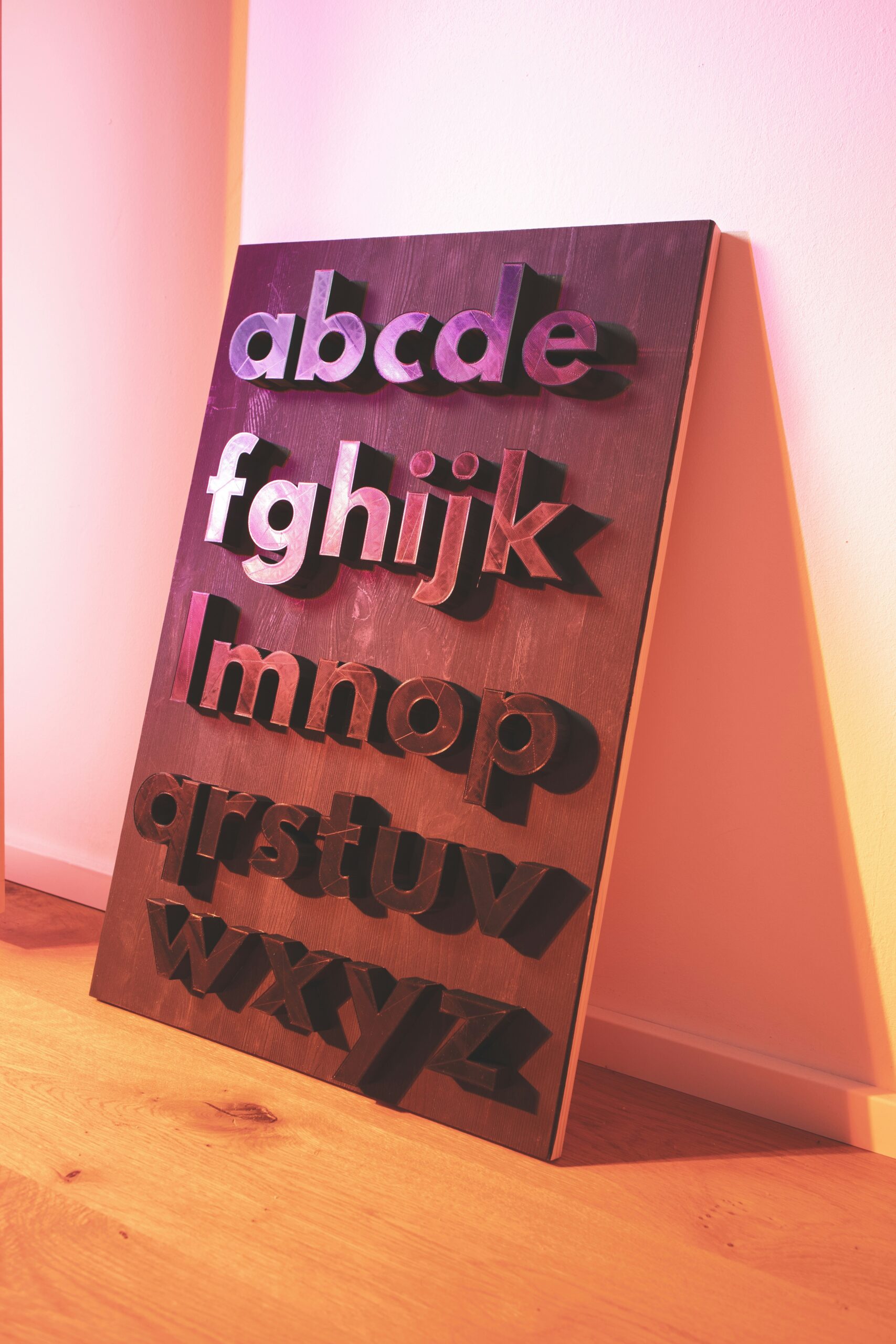
Slab serif is a type of font whose serifs are thick, large, and block-shaped, standing out in every display. Some of the letter stems have the same thickness and have feet or small elements attached to the end of each character’s stroke.
Just like in all font families, slab serif fonts have certain traits that make them popular. You can leverage them well in your projects if you understand all the traits below:
A terminal refers to the end of a stroke in a letter that lacks a serif. In slab serifs, the terminal can take on various forms: rounded, sharp, angled, or dull.
Slab serif fonts offer a range of thicknesses designed to suit specific purposes. For instance, slab serif fonts, perfect for advertisements or larger media, must have a striking boldness to grab attention. In smaller-sized media, however, readability plays a more significant role, allowing for a reduction in thickness.
Aside from boldness and terminals, slab serif fonts also have various stroke widths depending on the purpose. The stroke widths refer to the straight or curvy lines of a character.
Slab serif, as a font family, also has unique classifications or substyles that shape the overall typeface. Here are the main classifications:
This group showcases the early slab serif style, characterized by their uniform thicknesses that create a striking resemblance among them. Furthermore, the characters in this collection have ball terminals or smooth, rounded edges.
The main characteristic of this group is the serifs, which are much thicker than the main stem of the letter. Thus, this font provides a dramatic effect suitable for sensational posters or announcements.
This group stands out with its distinctive bracketed curves that elegantly connect the serifs and stems. Moreover, it stands in stark contrast to the serif itself. This group frequently features expanded curves near the letter’s main stem.
In this group, there are no bracketing and serifs, and the letter stems have uniform thickness. Consistency within this group makes it a favorable choice for high readability, especially on small digital device screens.
This group is the easiest to recognize because it includes fonts used on typewriters. The main characteristic of the font is that each character has the same horizontal width, creating a distinctive monospaced appearance.
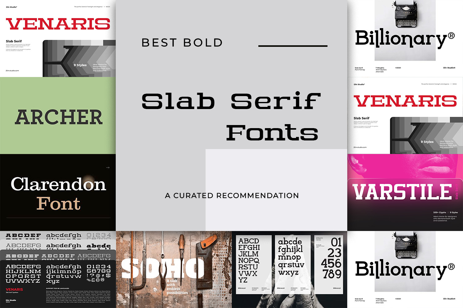
Elevate your projects with a stunning and personalized flair by exploring the best slab serif fonts recommended below:
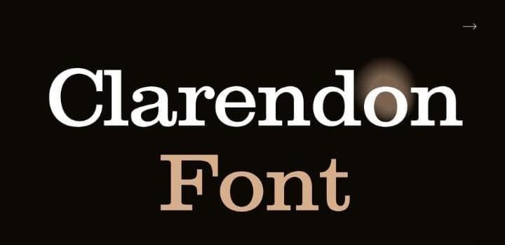
At the top of the list is Clarendon. This font stands out as a timeless slab serif, characterized by its bold and solid strokes. It mirrors the contemporary styles we usually use for our main texts. Additionally, Clarendon features a striking contrast in thickness across its strokes, making it ideal for creating headlines, posters, and more.
Link of font demo: Click Here
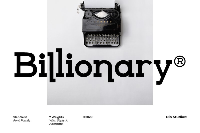
Next we have Billionary, a slab serif font that is stylish, adventurous, and beautiful. This typeface is one of our best slab serif fonts, perfect for enhancing your social media branding to new heights.
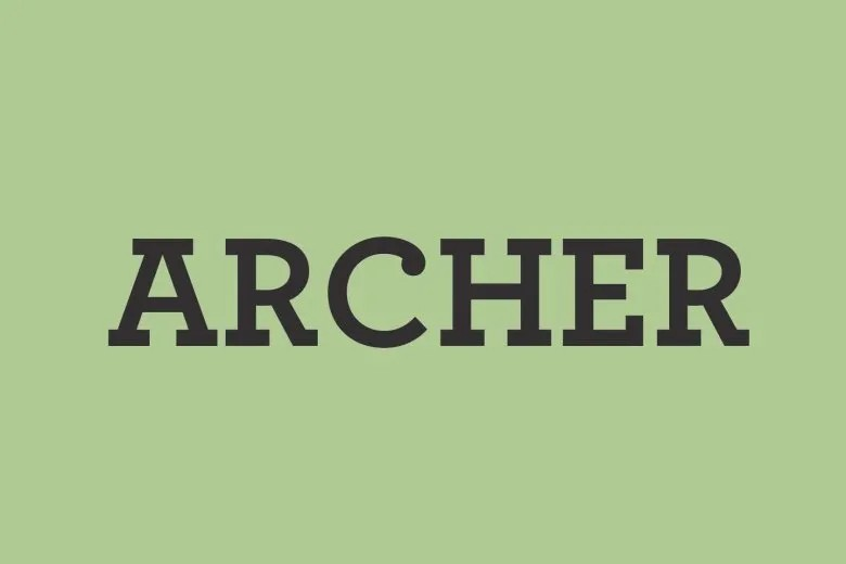
The Archer font features an outstanding humanist design with the use of serifs. This font features intentional design changes to reflect neutral authenticity, support, humbleness, and admiration.
Link of font demo: Click Here
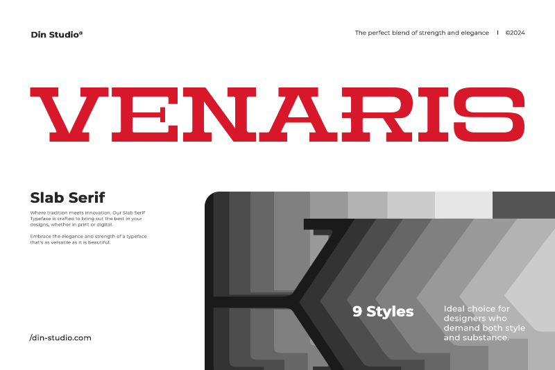
Venaris stands out as a slab serif font family, exuding a contemporary and sophisticated personality. Featuring 9 distinct weights, it delivers exceptional smoothness for a range of design projects. Additionally, the lines are clean and perfectly balanced, delivering a modern and polished look.
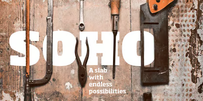
Soho marks the beginning of the current resurgence of slab serif fonts. This font provides exceptional versatility for branding, text, and visual displays. Additionally, it offers unlimited design possibilities, ranging from elegant thin lines to the strong and sturdy appearance of thicker weights.
Link of font demo: Click Here
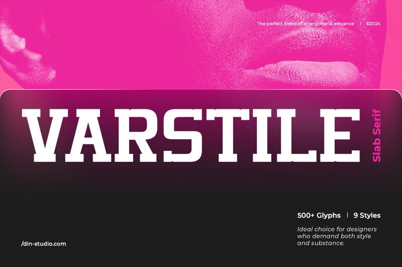
Last but not least, we have Varstile. Carefully designed by combining elegance and strength, Versatile offers incredible flexibility, making it ideal for luxurious designs. Furthermore, its timeless charm will elevate your projects to new heights.
In conclusion, slab serif fonts have established themselves as an essential part of typography since their surge in popularity during the 19th century. This typeface features unique serif thickness, making it perfect for a wide range of design applications. Additionally, its unmatched visual adaptability ensures it remains relevant across different eras and serves various design purposes.
So, are you ready to use slab serif fonts in your upcoming design project? Take action today and elevate your designs with our trustworthy recommendation!
