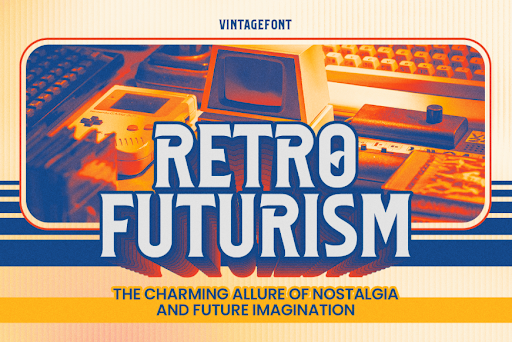
In this modern era, vintage logo styles have a strong appeal, bringing a classic nuance, visual warmth, and character that adds meaning to modern designs. Because of this, many modern brands opt for a vintage-inspired design approach. Vintage style can emphasize an identity that is more personal, authentic, and closer to a tradition’s values. A vintage logo is not only a visual appearance but also a reflection of storytelling and strong craftsmanship.
To effectively present a vintage feel, designers must understand vintage logo principles, as these serve as the main foundation. Vintage logo principles are the combination of design elements that create a nostalgic and classic feeling to deliver the brand’s story. Every element—from the sturdy basic shape and structured composition to typography choices and textures—has an important role in building an aesthetic, harmonic, and attractive look.
This article will explain vintage logo principles in a structured manner, which allows you to implement them in various design projects. These principles are important because without understanding the foundation, designs will look random and lose the vintage essence itself.
Table Of Content
A strong basic shape is the main visual foundation in vintage logo principles. Commonly, vintage logos use simple geometric shapes, such as circles, shields, or diamonds, in their application. Those geometric shapes create a nostalgic and timeless impression in the planned design.
Here’s a more complete explanation of the basic shapes often used in vintage logos:
The shape selection or basic structure should be determined from the outset of a vintage logo. This will influence the arrangement of text, icons, and supporting ornaments.
Visual hierarchy helps designers in directing the audience’s view to understand the brand’s messages through the presented visuals. Generally, the audience’s view flow begins with the brand’s name, followed by the main icon, and then supporting information, such as a tagline or the year of establishment. A clear sequence makes the logo easily understandable to a wider audience and creates a memorable identity.
This structure has a balanced and symmetrical composition and a prominent central object. Elements such as arched text, dividing lines, or small decorations help organize the elements without making the design feel crowded.
Without a good visual hierarchy, a vintage logo will lose its visual focus and look messy. Vintage logo principles ensure each part works in harmonic order.
Typography is a crucial element in determining the character of a vintage logo. Every style of font brings a different feel, starting from the elegant classic serif, sturdy slab serif, to friendly and nostalgic retro script. Therefore, the font selection should be in harmony with the brand personality you want to build.
Vintage styles depend a lot on the sharp detail of the serifs, bold curves, and condensed shapes that help create a visual depth and a strong classic nuance. Font characters help create a classic atmosphere without using too many ornaments. Visit vintagefont.net and find various fonts suitable for your vintage design.
Aesthetics is important, but readability and clarity should always be the top priority. Fonts that are too crowded with decoration or lines that are too thin can reduce the readability of a logo, especially at small sizes. Consider a combination of vintage style and visual legibility to make your logo typography effective.
In vintage logo principles, icons and symbols have an important role in creating contexts and meanings in a logo. Many classic designs utilize elements like anchors, wheat, mountains, and coffee beans to represent a specific brand image without the need for extensive explanation. The right symbol can make a logo feel more vibrant and relevant.
The use of icons in vintage style usually follows a simple but meaningful shape, which is often seen in monoline illustrations or solid silhouettes. Avoid overly complicated details to emphasize clarity and relevance to the brand’s character.
Icon selection must go through a proper design with the brand’s vision and mission, not merely for decoration. An irrelevant icon can ruin the visual message. When icon and symbol unify with shapes, hierarchy, and the proper typography, a vintage logo will have a strong and recognizable story.
Color has an important role in building a unique atmosphere in vintage logo principles. The common palette usually uses colors that are muted, a bit desaturated, and have an earthy vibe, like burnt orange, forest green, warm beige, or strong navy. These colors give a warm, classic, and not too flashy impression.
The vintage color approach usually avoids flashy or neon tones, because it can make the logo lose its nostalgic nuance. Soft contrast and natural color combination help create a more authentic visual and are easy to apply in various media.
Here are some examples of color palettes that are often used in vintage designs:
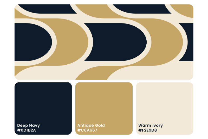
Colors from this palette give an elegant, classic, and premium impression.

Rustic and handcrafted palette has a warm, natural, and earthy vibe.

This palette gives a more playful and nostalgic feel.
Texture plays a significant role in enhancing the classic feel of vintage logos. Effects like grain, halftone, or a slightly worn finish help create the impression of a logo printed using traditional techniques. Texture creates a more vibrant impression and reduces the digital appearance, making vintage characters appear more natural.
Albeit attractive, the use of texture needs to be controlled to keep it readable. A texture that is too thick can obscure typographic or icon details, compromising the logo’s visual readability. Using a finer texture often produces a more elegant result and remains easy to apply across various media.
In most cases, texture is applicable in specific areas like the letter’s edge or background. With the proper placement, the logo remains structured and at the same time has a warmer and more authentic character.
Visual consistency is an important part of implementing vintage logo principles. Though the vintage style is rich in details and characters, each element, like basic shape, typography, and color, must be used consistently across all media. This allows the audience to better recognize the designed brand across multiple media and promotions.
In practice, vintage logos have several uses, ranging from a heavily textured version to a clean, unadorned version. These adjustments are not intended to change the style, but rather to ensure that vintage design principles remain useful for a variety of applications.
Maintaining consistency across all uses, such as printed materials, promotional visuals, or digital displays, making a brand identity feel stronger, more professional, and more recognizable. This demonstrates that implementing vintage logo principles isn’t just about aesthetics but also about function and visual clarity.
Every element in vintage design plays a crucial role, and understanding the basic principles will create a logo that not only looks classic but also functions effectively as a brand identity. By mastering basic shapes, visual hierarchy, typography, icons, colors, and textures, designers can produce more focused and consistent work.
Implementing vintage logo principles also opens opportunities for brands to appear more authentic and have a recognizable character. When each principle works harmoniously, a logo doesn’t just create a retro feel but becomes a strong and meaningful visual representation.
Understand and implement these basic principles in every vintage logo project you create, and achieve authentic and memorable results. You can also read our other articles on vintagefont.net for more design references and insights.
To understand how these principles appear in practice, readers can continue the discussion about vintage logo styles in this article
