Brands with a contemporary approach have increasingly used vintage monogram logos recently. Modern vintage monogram logos combine traditional monogram structure with a cleaner and more controlled visual approach. Monogram vintage logos, unlike the classic vintage style that is often ornate, rely on the simplicity of shape and neat proportions, which gives the logo an elegant feel without being overly traditional.
A monogram logo is a type of letter-based logo that combines initials, usually consisting of two to four letters, into a single symbol. Therefore, creating a modern vintage monogram logo is not easy; many designs fail because they are too decorative or lose their vintage character altogether. Thus, acknowledging the basic rules for designing modern vintage monogram logos is crucial before implementing them as part of your brand identity.
This article will talk about how the structure, typography, proportion, and context of monogram usage work in the modern vintage approach. Reading the article will help you create a monogram logo that will appear distinctive, useful, and simple to use across a range of media.
Table Of Content
Modern vintage monogram logos are defined by a balance between classic character and modern visual application. The main characteristic lies in the use of simple initials, minimum ornament, and neat proportion. Moreover, vintage nuances don’t come from excessive decoration but rather from the letterform, stroke contrast, and smooth typography detail.
Unlike the classic monogram, which often appears formal or regal, the modern vintage approach creates a lighter and more flexible monogram feel. This type of logo has a distinct function to remain legible at small sizes and is easy to use on digital media. Therefore, modern vintage monogram logos are perfect for the brands that seek a premium and timeless feel without necessarily appearing old or exclusive.
In modern vintage monogram logos, visual structure determines whether the monogram is relevant or loses its vintage feel. Generally speaking, readability and simplicity are the cornerstones of this logo.
The following are some main structures we need to pay attention to when creating this type of logo:
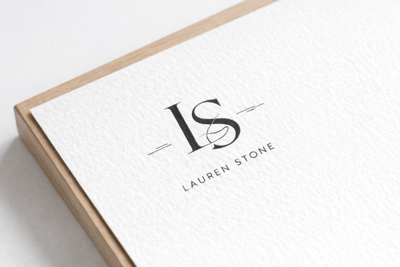
Modern vintage monograms usually use one or two initials to maintain the logo’s focus, relevancy, and recognition.
The letters in the logo are side by side or intersect each other smoothly, without complicated interlocking.
Negative space, or the distance between letters, is wide, keeping the monogram logo from feeling heavy.
The overall logo structure is clear and uncomplicated, which supports the readability of smaller logos in labels, icons, and digital media.
Modern vintage monogram logos don’t depend on frames, ornaments, or excessive structural decorations.
Typography is crucial in creating the character of modern vintage monogram logos. This is because a monogram depends on only one or two letters; those letterforms are what convey the vintage nuance. Modern approaches usually favor lighter, more controlled serifs rather than heavy or decorative serifs that make a logo look too old.
Lightweight serifs, transitional serifs, or serifs with smooth details are some of the typefaces that are often used to provide a classic touch without compromising readability. The smooth stroke contrast supports the letters to make them look elegant and stable in various sizes. In some cases, classic-nuanced sans serifs can also be used as long as the shapes are not too geometric or extremely modern.
On the other hand, decorative script, blackletter, or ornamental serif typefaces should be avoided. Typefaces with these characteristics tend to make monograms appear stiff and inflexible in various applications. In the context of modern vintage monogram logos, proper typography can maintain a balance between classic character and visuals with modern nuance. Visit vintagefont.net and find the proper typography for your monogram logos.
Besides structure and typography, proportion and small details have an important role in creating modern vintage monogram logos. Due to the limited elements, every difference in line weight, letter height, and space between elements will be noticeable and will affect the overall impression of the logo.
Generally, the letter proportion is harmonious and not too extreme. Modern vintage monograms avoid strokes that are too thick or too thin, because those can disrupt the readability. Monogram logos feature smooth details, such as the tip of the stroke, the letter terminal, or the intersection of lines, which provide a classic character without adding classic ornaments.
This logo style emphasizes control, not decoration. Small details function as an accent that enriches the letter’s character, not as the main element. Moreover, with maintained proportions and proper use of detail, modern vintage monogram logos can look elegant, stable, and easy-to-apply in various branding contexts.
Color is crucial in strengthening the characters of modern vintage monogram logos, especially because the shape of monograms tends to look simple and has minimal elements. In general, the colors used to make monograms are limited, focusing on neutral colors or those with classic nuance, such as off-white, cream, navy, dark brown, or dark grey.
Furthermore, color approaches like those above help monograms to look stable and consistent in various media. Rather than using various colors, the dark-light contrast becomes the key to the letter readability. Because of that, many modern vintage monogram logos maintain their strength with a one-color version, whether it’s white or black.
In addition, the controlled use of color provides significant flexibility in branding applications. You can easily place the Monogram vintage logo on packaging, labels, digital media, or printed media without losing its visual character. In the context of modern vintage, color functions as a support to the character, not as the center of attention.
Modern vintage monogram logos are the most effective when a brand wants to look simple, elegant, and characterful without depending on a crowded visual element. Since monograms rely solely on initials, this style requires a strong and clear brand identity from the start. Here are the brand categories that are perfect for using modern vintage monogram logos:
This logo is perfect for fashion brands, lifestyles, skincare, or artisan products that emphasize details and quality. The brand’s initials help create an exclusive impression, while the vintage approach gives a classic nuance that doesn’t feel like too much. In this context, monograms function as an identity symbol, not only a name marker.
Because of the simple structure, modern vintage monogram logos are ideal for labels, small packaging, caps, favicons, or digital applications. The logo is still readable and consistent, even though it has a limited size, something that is difficult to achieve with too-complex vintage logos.
A brand seeking to align with long-term visual trends should opt for the modern vintage monogram style. With a simple structure, controlled typography, and neutral colors, monograms help the brand identity to maintain long-term relevancy.
Modern vintage monogram logos show how the classic feel doesn’t always come from a complex ornament. With a simple structure, controlled typography, and proper selection of proportions and colors, monograms bring vintage character without losing their relevance in a modern branding context.
Furthermore, the strength of this style lies in its balance. Its classical character is evident in the smooth details of the letterforms and their visual proportions. Meanwhile, the modern approach maintains the logo to look light, flexible, and easy to apply in various media. Because of that, modern vintage monogram logos are perfect for brands that desire to look elegant, consistent, and timeless.
Finally, this style proves that vintage design can evolve and adapt without losing its essence. If you are interested in other modern vintage logo styles, check out the article 6, “Modern Vintage Logo Styles for Contemporary Brands.”
