
Discussing the Roman typeface is delving into a rich historical narrative. It stands as one of the three main historical types, the others being Blackletter (often referred to as Gothic) and Italic. Of the three, the Roman typeface stands out as the most significant and widely utilized.
The elegant and balanced shapes of the Roman typeface have influenced countless texts and designs throughout centuries. In fact, it forms the foundation of the majority of our reading material today.
This article will delve into the style’s evolution from ancient Roman inscriptions to its modern applications. It also aims to explain the often misunderstood connection between Roman style and serif fonts. Additionally, we will explore the actual problems that designers encounter when utilizing Roman type and investigate the reasons behind the shift from the term ‘Roman’ to more specific terms, such as ‘upright’ or ‘regular’.
By the end of this exploration, readers will gain a deeper appreciation for the enduring legacy of Roman Typeface and its continued relevance in contemporary design.
Table Of Content
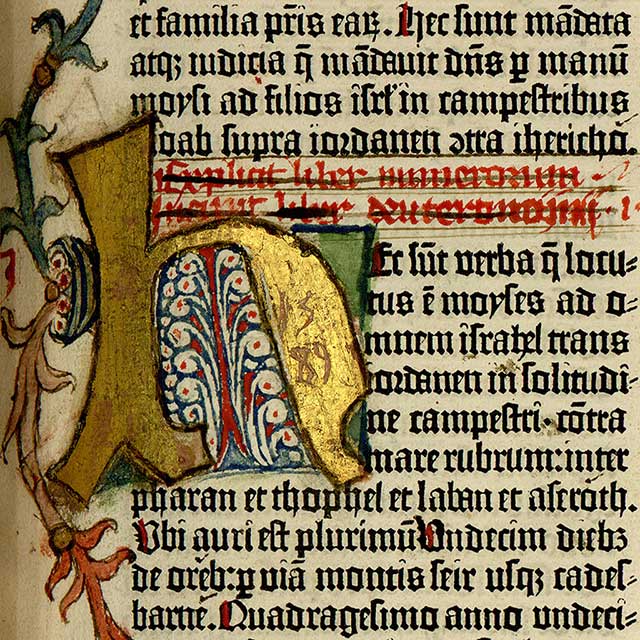
The radical improvement of the printing press that Johannes Gutenberg made in the mid 15th century is no doubt one of the most important in the history of type evolution. It introduced the concept of Blackletter typeface, allowing common people to gain knowledge that was previously only for certain selected people.

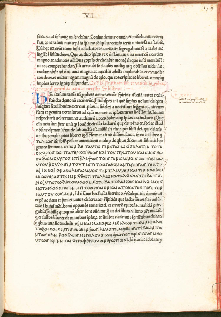
However, since the original blackletter fonts were not very visible for a body of text, the Roman typeface then emerged in the same century. One of the earliest Roman typefaces is the Jenson typeface. Nicolas Jenson, a 15th-century printer, is credited with designing one of the earliest and most influential roman typefaces, which set a standard for future roman fonts and continues to be a reference point for contemporary designers.

This typeface’s legibility was great, especially compared to the blackletter of Gutenberg, as they were based on straight lines and regular curves. Especially in the body text part, Jenson came out as the better option. As a result, Blackletter became less popular for printing in most of the countries except for all Germany speaking countries.
With the rise of the printing press, the Blackletter typefaces soon revealed difficulties for readers when it came to extended passages of text. People demanded text that was more easily accessible and simpler to read. In Italy, during the Renaissance era, the foundations of the Roman typeface began to flourish. Drawing inspiration from the graceful handwriting styles of the era, which took back to the classic Roman scripts, early printers began experimenting with innovative letterforms.
In Italy, Sweynheym and Pannartz, a pioneering German printing duo, were important figures in shaping this revolution. Their printed letters drew inspiration from the elegant and rounded handwriting in Italian books of that time.
source: The Sweynheym & Pannartz Lactantius, the First Dated Book Printed in Italy, Containing the First Printing in Greek : History of Information
Their early Roman typefaces showcased capital letters, reminiscent of ancient Roman monuments, alongside lowercase letters that offered a more visually pleasing alternative to the dense forms of Blackletter. Despite the challenges faced, Sweynheym and Pannartz’s pioneering designs established an important basis for the Roman typefaces that emerged later.
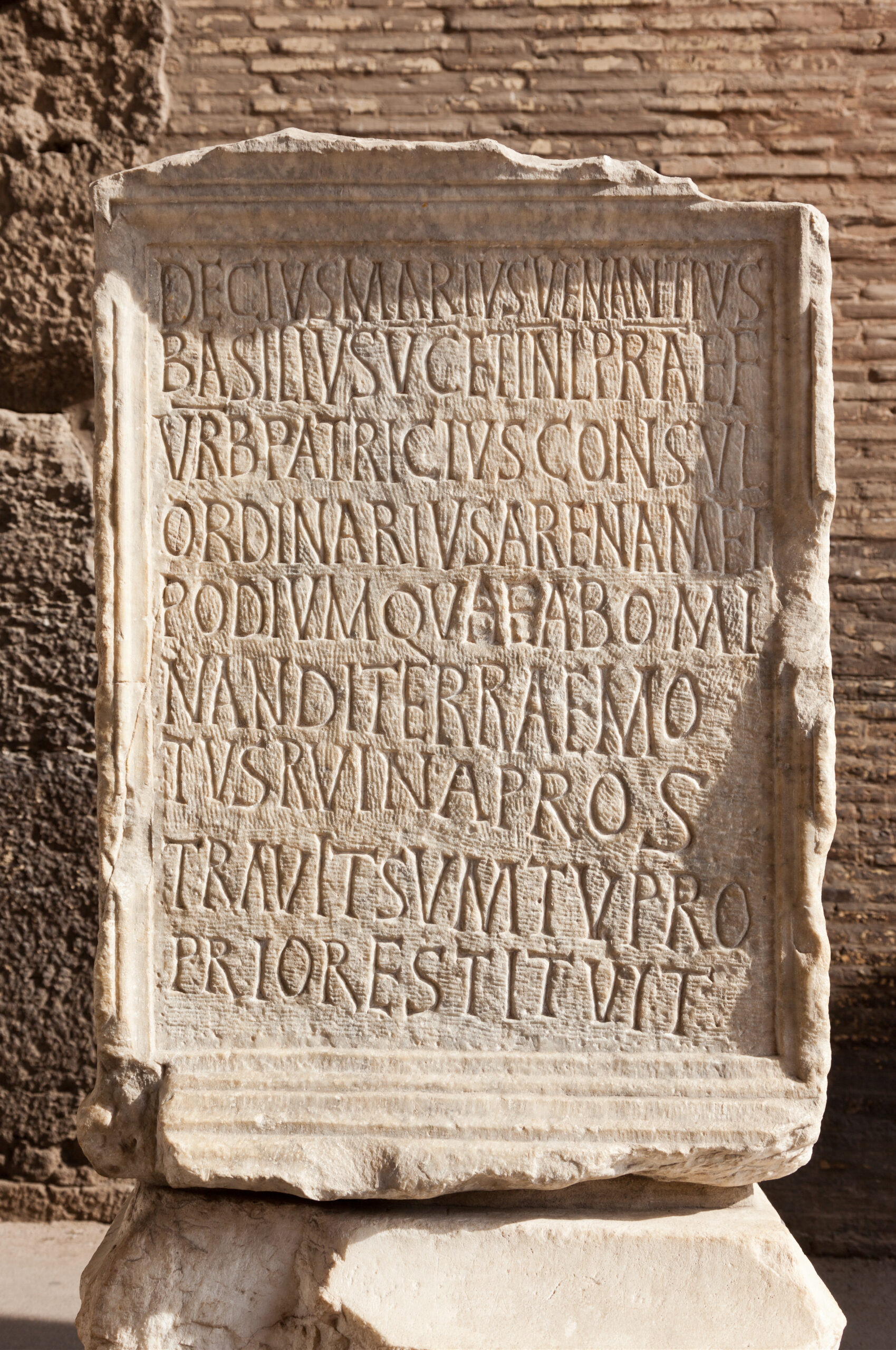
Ancient roman epigraph. Inscription located in Colosseum Arena, Roma, Italy.
The Renaissance, marked by the rise of classical art and literature, created an ideal environment for the acceptance of these more open and balanced letterforms. Roman typefaces gained immense popularity in the early 15th century, particularly in the realm of printing and scholarly texts.
Nicolas Jenson created one of the most impactful early Roman typefaces, as previously noted. His designs struck an impressive harmony and clarity, featuring elegant curves and the delicate finishing touches known as serifs. Jenson’s work marked a remarkable advancement in the development of a typeface that seamlessly combined beauty with readability.
In contrast to Blackletter, Jenson’s Roman type exuded a sense of lightness and openness, establishing itself as the preferred choice for prolonged reading sessions. This groundbreaking development established the Roman typeface as a standard for printed text, a legacy that still influences our reading experience today.
As the Roman style of letters became more and more popular for printing, it didn’t stay exactly the same. Over time, it gradually changed in appearance, and we can generally group these changes into three main styles: Old Style, Transitional, and Modern.
The Old Style Roman typefaces are the earliest versions. These letters have a kind of natural, hand-drawn feel to them. The thick and thin parts of the letters are similar, and the serifs are usually rounded. They have a classic and gentle look, a distinct trait of early days printing.
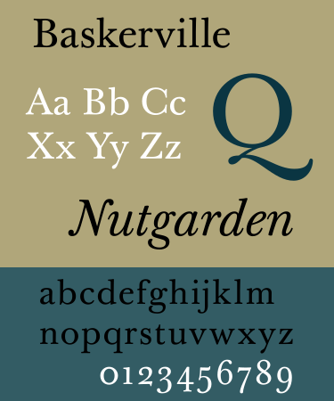
Later on, as printing got better, a new style called Transitional came about. These fonts were like a bridge between the Old Style and something newer. The thick and thin parts of the letters have a bit more difference, and the serifs became sharper and less rounded. Fonts like Baskerville are good examples of this style. They look a bit more refined and precise than the Old Style.
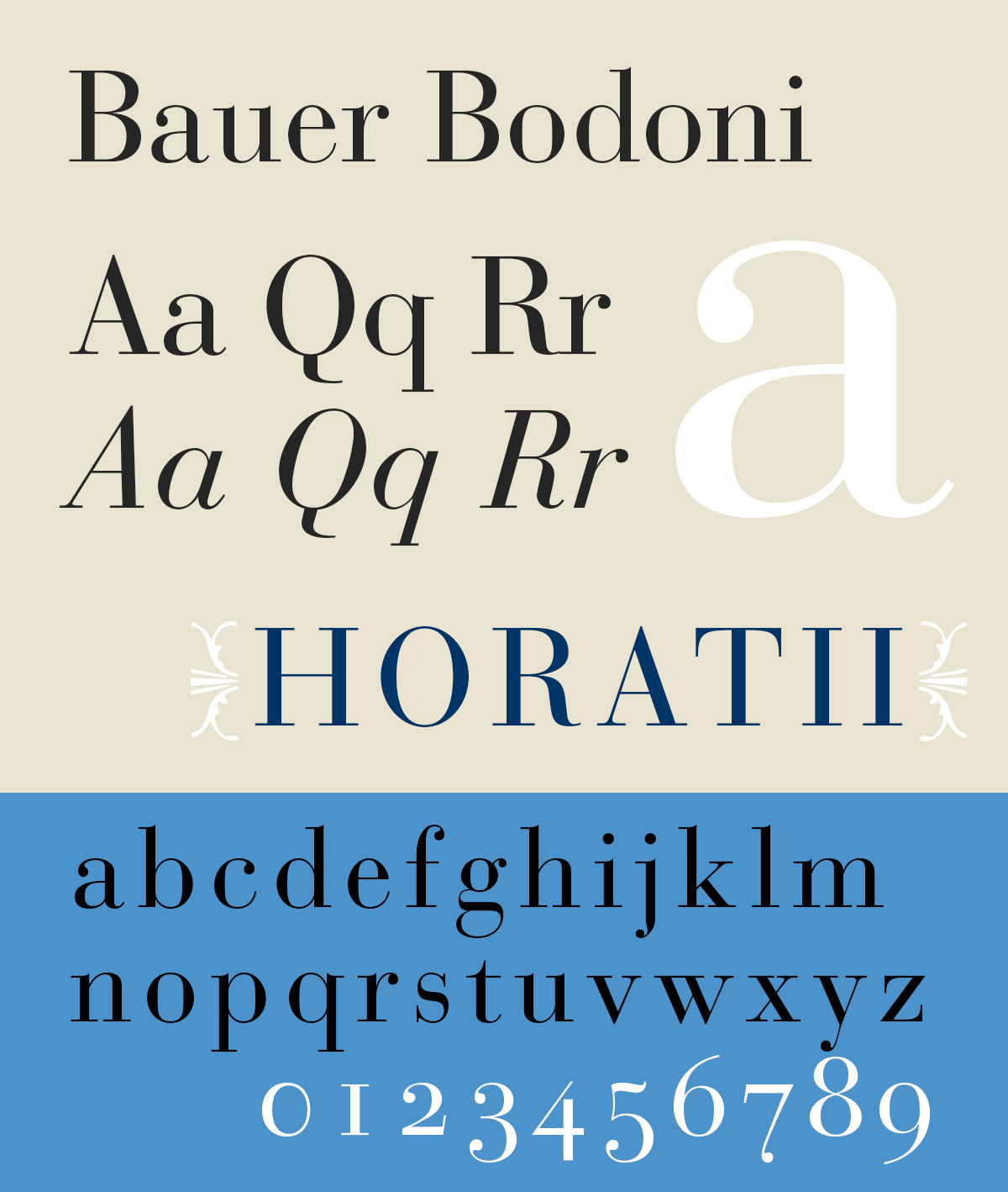
Finally, we have the Modern Roman typefaces. These came even later and have a very distinct look. There’s a big difference between the thick and very thin parts of the letters, and the serifs are usually just thin, straight lines that stick out sharply. Fonts like Bodoni are in this category. They often look very elegant and dramatic.
Understanding these three main styles helps us see how the Roman typeface has evolved. Each style has its personality and can give a different feel to the words on a page. Designers choose these different styles depending on the message they want to send and the overall look they want to achieve.
Roman and serif refer to basic concepts in typography that define the standard, upright style of a typeface. Roman style represents the classic, upright presentation of letters, drawing inspiration from ancient Roman inscriptions and the earliest printed works. The characteristic that defines it is its vertical orientation. Meanwhile, serifs are distinctive design elements that adorn the ends of larger strokes in letters, often resembling tiny “feet” or “flags” at the top and bottom of the letterforms. Upright serif fonts are classified as part of the Roman style.
However, not every Roman-style font needs to feature serifs. The designation “Roman” mainly refers to the vertical alignment of the letterforms, whereas italic fonts are excluded from the Roman classification if they feature serifs. Italic fonts are uniquely defined by their slanted appearance, separating them from the traditional upright Roman style.
Essentially, Roman refers to the upright orientation, whereas serif highlights a particular visual characteristic—the small finishing strokes. Numerous classic typefaces exhibit a Roman style and feature serifs, often leading to some confusion regarding the terminology.
The era continues to develop, and so does typography. The term Roman can only be used when the alternative typefaces were only blackletter and italic. However, using the term to describe the typography will no longer relate. Nowadays, we cannot put different styles of font including serif, sans serif, slab serif, and many others in one general term.
The use of the term Roman nowadays will cause a lot of ambiguity because upright typefaces already have many variations. Although the Roman term has a historical significance, the increasing variety of typeface designs needs more precise and clear terms. The terms are also more relatable to most designers.
To summarize, this article examines the historical journey of the Roman typeface. It emphasizes its 15th-century arrival as a more readable option than Blackletter and its main typeface categories. It also distinguishes between the “Roman style,” referring to the upright orientation, and the decorative serifs.
While “Roman” holds historical significance, the variety of typefaces led to precise terms like upright or regular in contemporary usage. So, explore more to see how these foundational Roman styles continue to shape modern typography in today’s design landscape!
